Archive for the 'Scenic Design' Category

Love’s Labour’s Lost

Posted in General Production, Scenic Design, Scenic Painting on November 16th, 2012 by Eric Appleton


The set for “Love’s Labour’s Lost” progresses.  The benches are built, but yet to get their stonework.  The piles of bead foam have been placed to work out the sizes of the stones to be carved.  The upstage pipes are in place.


Two of the botanical prints I worked on today.


And finally, students carving foam stones.  Though I had to go over and show them that whittling the whole thing down with a rasp was not the most efficient method. . .

Love’s Labour’s Lost

Posted in General Production, Scenic Design, Scenic Painting on November 15th, 2012 by Eric Appleton


In the Hicklen Theatre, with students laying out and gluing together blocks of foam for the rocks by the stream.


My project for the afternoon — working on the botanical prints.  At this point, I have half of them traced out, and got four of those tracings colored today.


The pears, before final sepia wash.


Two completed flats, after the sepia wash.


Panels

Love’s Labour’s Lost

Posted in General Production, Scenic Design, Scenic Painting, Student Work on November 9th, 2012 by Eric Appleton


Base coats on the platforming for “Love’s Labour’s Lost.”   Circuiting is happening at the same time, so that’s freshman Jake Taylor standing there with his lighting stick.   I’m glad he waited until the paint was dry.  The collage painting on the stage floor is left over from this past summer’s “I Love You, You’re Perfect, Now Change,” designed by student Keenan Minogue.

In an earlier post, I mentioned that we were going to go with carpet, and I changed the rendering to reflect these textures.  Sadly, the budget won’t allow it, so we’re back to paint.


The final project for the scenic portion of Introduction to Theatrical Design was due yesterday, and here are some of the projects on the bulletin boards outside the classroom.  Students chose to work on one of these three plays:  “The Weir,” “The Holy Rosenbergs,” and Wole Soyinka’s version of “The Bacchae.”

Aladdin

Posted in General Production, Scenic Design, Scenic Painting on October 30th, 2012 by Eric Appleton


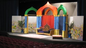
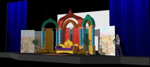
The finished “Aladdin” set under worklights.  The orange ‘onions’ were added to hide the join between the green and red arches, since it wasn’t possible to carve the compound angle necessary to make them butt cleanly.  The show is now touring to area schools.

Aladdin

Posted in General Production, Scenic Design, Scenic Painting on October 26th, 2012 by Eric Appleton


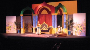
During last night’s technical rehearsal.  The princess in the throne room.  The throne is not quite done, but I’m quite happy with the way the tiling on the column turned out.  Lighting design by student Sean Jensen.  Costume design by student Julia Boarini.


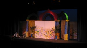
Street scene with Aladdin and his mother.

Aladdin

Posted in General Production, Scenic Design, Scenic Painting on October 25th, 2012 by Eric Appleton


In the shop this afternoon, making the push to finish the tile painting on the blue columns.  We’ll finish the last two green ones tomorrow afternoon.


The throne with first paint on it.   This, too, will be finished Friday afternoon.  We’ll be bedazzling the heck out of it.


And finally, when you don’t have the one planter you want, you take two planters and turn them into one.

Aladdin

Posted in General Production, Scenic Design, Scenic Painting on October 25th, 2012 by Eric Appleton


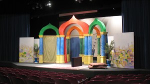
Getting set up for tech last night.  Yes, still a fair amount to be done, primarily finishing all the tile painting on the columns and painting the throne (not pictured), and the join between the green and central arches is awkward and will be covered by an additional ‘onion’.  But it all looks suspiciously like the rendering. . .


Aladdin

Posted in General Production, Scenic Design, Scenic Painting on October 19th, 2012 by Eric Appleton


This afternoon’s paint work — the other upstage masking flat for “Aladdin.”  Here it is with the bulk of the color laid in.  The interestingly shaped plywood leaning in the back are the beginning pieces for the throne.


And here is it at the end of the afternoon, finished.


And the Intro to Theatre students continue covering the arches with cheesecloth.  Tomorrow they’ll get primed white.


Aladdin

Posted in General Production, Scenic Design, Scenic Painting on October 18th, 2012 by Eric Appleton


Paint work from yesterday.  These are two completed masking flats for the upcoming production of “Aladdin.”  These two flats will be picked up and moved center for the street scenes.  That’s  one of our students off to the side speaking with TD Steve Chene about how they will fix the right hand flat, which was built more rhomboid than square.  The blue pillar will get a diagonally sloping tile pattern.


A pause during today’s paint work.  About halfway through laying in the colors.


In the shop.  Student in the Intro to Theatre class are covering the arches with cheesecloth preparatory to painting.


End of day.  Almost finished with this folding masking flat for offstage right.  A little more line work, some shading on the trees, and then tomorrow it’s onto the final masking flat for stage left.


Love’s Labour’s Lost

Posted in Drawings, Scenic Design on October 11th, 2012 by Eric Appleton


“Love’s Labour’s Lost,” now with carpet textures!   One of those semi-happy accidents when it comes to media.  Jim assumed from the sketchup renderings that we were going with carpet.  I didn’t think carpet fit within the budget, so was intending to paint texture on masonite.  The matter came up at a production meeting, Jim stated his desire for actual carpeted texture and Steve felt the budget could afford it.  I spent bit of time on the Menard’s and Home Depot websites looking for the cheapest carpet that would do the job (though I still intend to stencil the perimeters), and here we go.   Steve currently crunching cost per square foot numbers and we’ll see if we can afford it!