Archive for the 'Drawings' Category
Graphics Seminar
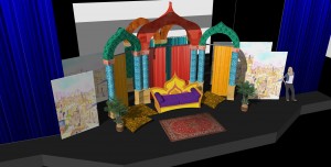
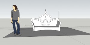
Posted in Drawings on February 4th, 2013 by Eric AppletonFurther progress on demo bits for the Graphics Seminar Sketch project. Applying textures, mapped out the laurel leaf piece, the red silk legs. . .
Graphics Seminar
Posted in Drawings on February 1st, 2013 by Eric AppletonWorking up the end result models for a project in the Graphics Seminar. This will be eventually inserted into the model of the Barnett Theatre. The students in the seminar will be given the plans and photos of last year’s “The Coronation of Poppea” and be instructed to model it using Sketchup. I chose this set because it’s pretty geometric, with much of the complexity being in the details — easy enough not to scare them, but complex enough they’ll have some puzzle solving to do.
Young Auditorium
Posted in Drawings on January 31st, 2013 by Eric AppletonContinuing with modelling the Young Auditorium. Now I need to go into the space and take some photos and double check some measurements. . .
Young Auditorium
Posted in Drawings on January 30th, 2013 by Eric AppletonAnd now, working up a model of the Young Auditorium, where we will be presenting “Our Town” later this semester. We are going fairly traditional with the production and fully acknowledging the space. This model is primarily to help the student lighting designer better visualize placement of items and assist in his own rendering and modeling efforts.
Barnett Theatre
Posted in Drawings on January 29th, 2013 by Eric AppletonSketchup Rendering of the Barnett Theatre that I am working on. It will be used for the Graphics Seminar — the students will be using Sketchup to create a model of our previous production of “The Coronation of Poppea” and placing it in this stagehouse.
Love’s Labour’s Lost
Posted in Drawings, Scenic Design on October 11th, 2012 by Eric Appleton
“Love’s Labour’s Lost,” now with carpet textures! One of those semi-happy accidents when it comes to media. Jim assumed from the sketchup renderings that we were going with carpet. I didn’t think carpet fit within the budget, so was intending to paint texture on masonite. The matter came up at a production meeting, Jim stated his desire for actual carpeted texture and Steve felt the budget could afford it. I spent bit of time on the Menard’s and Home Depot websites looking for the cheapest carpet that would do the job (though I still intend to stencil the perimeters), and here we go. Steve currently crunching cost per square foot numbers and we’ll see if we can afford it!
Love’s Labour’s Lost
Posted in Drawings, Scenic Design on October 2nd, 2012 by Eric Appleton
And of course, one has to take into consideration the seating. I discovered that I hadn’t allowed enough clearance for the first row on house left and things had to shift accordingly. This version also has the forest green fabric upstage and the sepia-motized botanical prints. The surfaces of the discs will NOT be carpeted — they’ll be painted with color and texture similar to what is in the image, with stylized leaf borders around their perimeters.


