Bright Invitations!

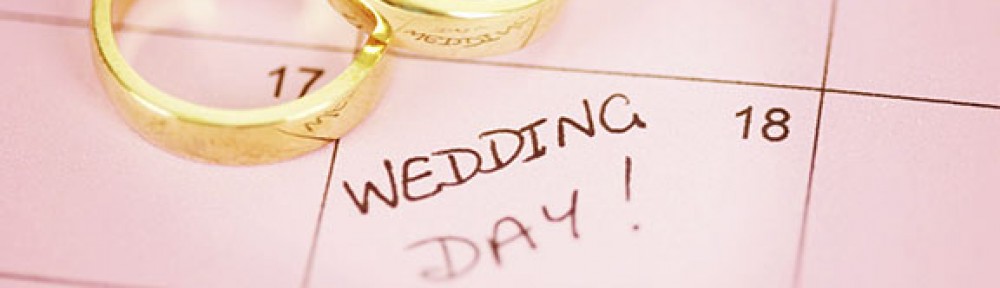
Hello for the last time everyone!

Sadly this is the last time during the school year that I will be writing to you on this blog. I wanted to take a moment to thank you for reading my posts and just taking the time out of your day to look at my blog. You all are truly amazing for allowing me to share my thoughts about these wedding themes and wedding invitations!

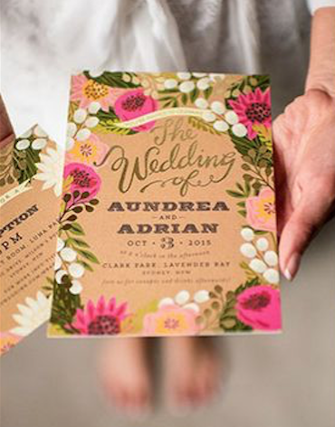
Today I have for you one last wedding invitation that I would like to talk about, the bright wedding invite.

Screen Shot 2017-04-25 at 8.50.42 PM


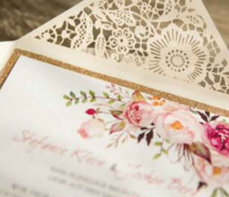
I am not going to say much about this invitation but I wanted to give you an example for the bright wedding theme. The thing that I obsoletely love the most about this the cut out of this on the envelope lip! It matches the flower theme from the wedding and lets you see the inside. This lets the guest get a sneak peek of what inside and what your wedding will be like.

Once again, thank you all so much for the support of my blog!

I will be posting after I graduate on May 13th, so look for more wedding posts then!

When I start up again I want to do a how my wedding planning is going theme. Let me know if this is something that you all would like to have or some different topics that you would like me to write about. I will also be taking suggestions for posts that aren’t relating to my wedding.

Have a great start to your summer!

See you all soon!

Blue and Gold Wedding Invitations!

Hello again everyone!

Thanks for coming back to read about the blue and gold wedding invitations!

I am going to take about the invitation that is below, I like this invitation because it is so simple and just has the two colors, gold and blue. I love the choice of gold as their type color against the dark blue background. This gives in enough contrast so that the guests can read it but the theme is still clear to the guests as well.

This one didn’t picture an envelope but I could see the envelope just being a plan white one or reversing the text and having the text be dark blue and the envelope be a gold color.

Screen Shot 2017-04-17 at 8.47.32 PM

This next invitation pictured below is very unique, I believe. I see this invitation as unique because of the gold strip that is acting as a holder for all the information that the guest has gotten in the envelope.

Another thing that I love about this invitation is that they throw another color that is really light but still noticeable on the invitations. This color is a very light pink.

They used the gold color and black for the type but I think it easy enough to read and guest wouldn’t have a hard time looking at the invitations.

The last item that I want to point out on this invitation is the blue boarder around the name card. That is an extra piece of paper behind there. However, I believe that it would be worth the cost because it pops out the most important part of the wedding, the bride and her groom.

Screen Shot 2017-04-17 at 9.31.57 PM

Thanks for reading everyone!

Garden Invitations

Welcome back everyone.

Today I will be talking about the garden invitations that go with our garden wedding theme this week.

I am excited to say that there is more consistence throughout the garden theme with this invitations.

I will be looking at this first invitation because it popped out at be when I was doing my research on this topic. The image below is the one that popped out at me. Almost all of the garden invitations have flowers and the colors of peachy, natural and green. However, this one popped out to me because it showed a different kind of paper. This is proving that the little details, like paper really do count.

Screen Shot 2017-02-28 at 12.04.13 PM


Here is an image below to show you what I am saying? Which invitations pops out at you? (Leave your answer and reasonings in the comment section, please.)

Invitations for Gardan theme

Now with this same image above, I am going to point out some aspects in the other innovations that I find appealing.  For the top left invitation I really enjoyed the design piece of adding a gold shimming color throughout it. For the next invitation on the top right hand corner, I like how the design of the flowers is acting as a boarder to the text but it isn’t over powering. The next invitation is the right hand corner second row, this one is keeping consistence through the three different invitations and the envelopes as well. The last two I like how they are incorporating ribbon into there designs. This gives the invitation something to connect with and it is now more interactive for the guests who are receiving them.

Thanks for reading this weeks garden themed invitations.

Can’t want to hear your comments on this invitation theme.

Stay tuned next week for a old time theme.

Rose Gold Invitations!

Hello again everyone!

If you are a different bride or just looking to make your wedding not like the norm then pay attention today!

Today I will be talking about rose gold invitations and what is so different about them compared to the generic template of an invitation.

When people use rose gold in their wedding they are thinking sparkly and clique. This is something that is different and something that is also unique. This invitation below gives the impression of something simple since there is no glitter but inside a shiny look on this invitation. The decorations and the type have these characteristics, which helps tie everything together and make it look cohesive throughout. This is so simple but says something about the bride and her style.

Invitation #1

This next invitation that is below is a save the date. Although this invitation is like the one above, there are some different characteristics in this one. The text in this has more style then the one above, which I love because that is just the touch this invitation needed to be more different then all the others.

Invitation #2

This next invitation has more details to it, having the ribbon and the envelopes for this really help tie everything together. It also makes it easier for the guests to keep everything in one spot without losing everything. This also just adds a personal touch that a lot of invitations do not have. The last thing I like about this invitation is that the bow is already done and the guests can take it off without ruining it and not being able to get it off.

Invitation #3

I hope you enjoyed this blog post about rose gold invitations!

Please post any questions or comments you have.

Have a great rest of your weekend and stay tuned for next weeks theme and invitations to go along with it!


Tropical Invitations!

Hello again everyone, hope you liked my posting about the theme tropically weddings!

It is now time to look into invitations for this tropical style wedding. I will look at these invitations from a designer perspective and a future bride perspective.

Below is the first invitation that is on this blog that I will give my perspective on. This invitations color is definitely leading towards the more safe side but still shows the personality and character that you want guests to see before the actual wedding. This one has a lot more color then last week’s rustic country invitations. However, on this tropical invitation it maybe a little hard for people to read that light colored text. A different harder paper could help with this; otherwise a little bit darker text color on this paper would make it easier for guests to read. I do like the consistence of flowers in these invitations and to differentiate between the two, they put a board around one and not the other. This is nice to keep to guests organized with what invitation goes with that other information’s for the same wedding.

Screen Shot 2017-02-13 at 11.55.29 AM

This next invitation that is pictured below is for the same theme of wedding, tropical but that invitation is very different then most invitations. First thing I noticed was that this invitation wasn’t on paper, which can be risky because you don’t know if the writing is going to stay on the leaf or smudge all over so it isn’t even readable when it arrives to your guests doorstep. Since it didn’t smudge the next thing I noticed was that it was handwritten out which means for every single guest, the hand wrote these invitations. This gives it real personality, this whole invitation is screaming personality, which I love and believe that is the best thing you can do to get your invitations to be kept by your guests.

Screen Shot 2017-02-13 at 11.55.52 AM

Thanks for reading up on this week’s themed invitation!

For you have any requests or you would like to comment on what I have wrote so far, please do so!

Have a great rest of your weekend and stay tuned for next week’s theme and invitation.

Country Wedding Invitations

Hello again everyone, hope you liked my first posting earlier this week!

It is now time to look into invitations for country style weddings. I will look at these invitations from a designer perspective and a future bride perspective.

Below is the first invitation that is on this blog that I will give my perspective on. This invitations color is definitely leading towards the rustic style because of the different shades of brown in the background of the printed paper. I would have some different colors in this invitation because right now nothing there isn’t any hierarchy. This would help for guests to know where the location or what times the different event was. However, I do really like the add-on that the invitations has from under the printing page, those include the ribbons that are added to the top paper. This adds more character and personality to the invitations for guests to enjoy. The set of three invitations here is consistent throughout the different types of forms for there wedding. This will help guest keep track of what invitations goes with what form for the reception. Trust me, when your guests have five weddings in one year they will thank you for keeping everything together and consistent throughout. I would say something that would help is to have an accent color added on these invitations. It could be a color that is your main wedding color or some kind of color that describes you and your fiancé. This invitation could have more personality and creativeness so that the guest will want to keep it and not just throw it in the trash when your wedding is done with. Doing this is just being more different then a plain piece of paper. You could make it 3-D by just folding the invitation differently with the same amount of paper that you could have used for just a paper over paper invitation.

Country themed Invitations

Thank you for reading this post. Stay tune for next week’s theme and invitation!