Every year, various designers come up with their own design predictions for the year. Whether or not these predictions comes true, that’s up for debate. Sometimes they come together and agree on a certain trend they are looking to see while sometimes they choose directly opposing trends. At the end of the day, it’s up to the homeowner what they want to include in their home. But, it is definitely fun to see what people think is going to be in style. Here’s a look at what they’re predicting for 2022.

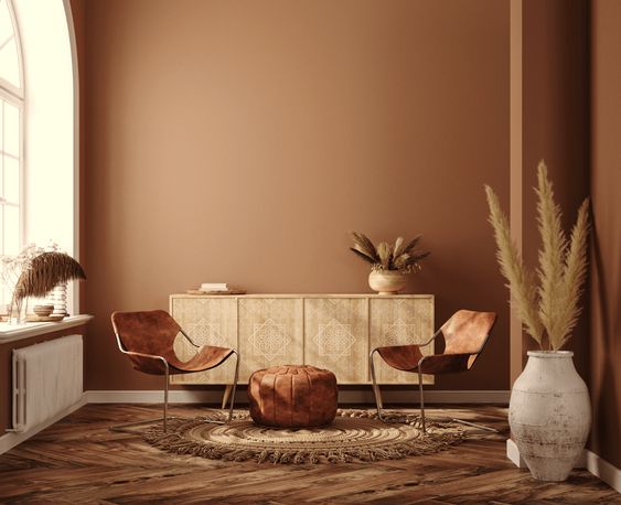
Hues of Brown
rooms if you choose the right color and vary the tone used. This however, is not it. Brown/tan is a nice neutral shade to incorporate with other color within your space. But making an entire room a neutral without any other color? It makes the space feel boring. Although the warm tones of the brown are nice, there’s no interest to be had.
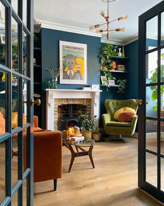
Bold Colors
The polar opposite has been predicted as well. Personally, I love a good mixing of colors and think it brings more life to a space. Unsurprisingly, I am not a minimalist and don’t think I ever could be. I use my space to make myself feel good about being in it, mostly by the colors I choose. I’m biased towards yellows, oranges and pinks but there can be any combination people like. The most important part of mixing colors is to mix them in a similar tone. Orange, blue and green don’t sound like they’d all work well together. But because each of them in the photo is a darker shade, there’s no clashing or fighting for attention in the room.


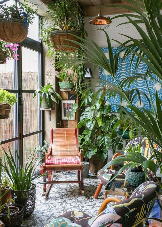
Houseplants EVERYWHERE
I personally wouldn’t say this is a trend that is brand new this year. The houseplant craze began more in 2018, but yet again there are no rules to what can be popular at what time. Houseplants bring life (literally) into a space with greenery and come in a variety of shapes and sizes. It provides a routine as well for a watering schedule, rotation schedule and can fill and empty space in the room. I love this trend and it’s here to stay.
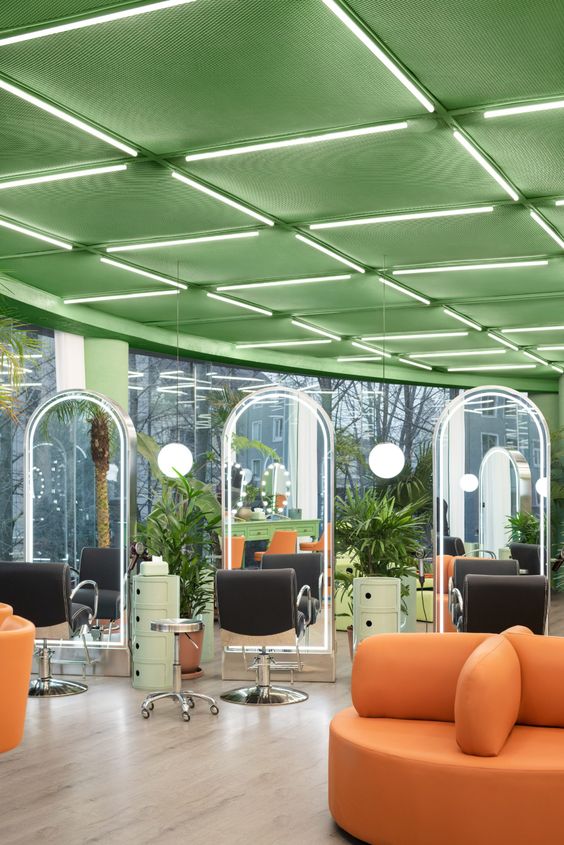
Curves
This might seem like an odd prediction. But think about it. Most of modern architecture is comprised of crisp lines and boxes. It can get monotonous to see the same shapes repeated everywhere you look. Adding in a curve, whether it’s something small like a pillow or mirror or big like a chair or couch, breaks up the typical space. I know carved archway D-I-Y’s are having a bit of a moment in the home construction zone, because people want something out of the ordinary. It feels softer and more relaxed to what everyone has grown used to. It’s a good way to break up your space and to make it feel like there’s more room than there actually is in a small college town dorm or apartment.

February 26, 2022 at 9:43 am
I agree that plants really make a home feel cozy. But all the cleanup and care seems really strenuous. I wonder if plants will ever fall out of trend or be replaced by fake plants.
February 27, 2022 at 7:27 pm
Hi Katherine,
I enjoyed reading your blog post about design. I have never thought too much about designing my room a certain way, but reading your blog post encouraged me to think more creatively. I never knew bold colors had such an impact on the design of the room. I also was surprised to read the part about curves, as that had never crossed my mind.
March 2, 2022 at 3:57 am
I totally agree with how boring the monotony of a single color/tone in a room is! I hate the minimalism trend, and love when people have splashes of color in a space, especially if the colors work well together. There’s more personality there, and frankly, I think if someone can find decor of different colors but put it together so that it looks nice, that shows way more skill than matching neutrals. I also gravitate toward yellow and pink in my space, with the addition of green. I have green vines and accents in my room, in addition to the plants. It really does liven a space up! Thanks so much for sharing!