
Food food food!
Thursday, February 16th, 2017Food is all around us, which naturally means design is too because it usually has to go in something. Packaging plays a huge role in what we as consumers decide to buy. Some major elements that draw us in are typography, color and logos/icons. All these influences affect you, the consumer, subconsciously and according to Business Insider, it only takes 7 seconds to make a judgement based on this quick information provided by packaging.
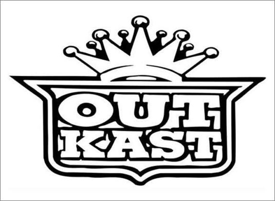
Brands that use icons/logos are on the right path and know exactly what they are doing. When you see a logo, it creates an emotional connection in your mind and in turn starts to solidify a relationship between the brand and yourself. With that said, sharing images of products with other people makes it more likely that they will also chose that brand when they are in the same buying situation.
The visual aesthetic qualities are the main points I want to share with you. As mentioned before, color and typography play a huge role in catching the consumers attention and then causing them to make the final purchase decision.
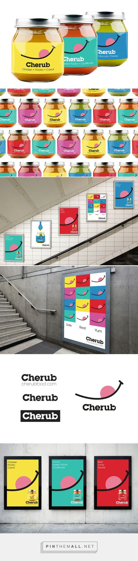
Color theory is a concept of using color to evoke certain emotions and to cause a specific emotional response to something. For instance, red can be seen as an exciting color. Orange is viewed as friendly and welcoming. Green, a very common color used in packaging, promotes the idea of fresh ingredients and Eco-friendly products. You wouldn’t want to buy a juice drink that has a muddy dark label on it, would you? Instead, you’re going to reach for the one with the bright colors possibly including shades of green (back to that fresh ingredient concept).
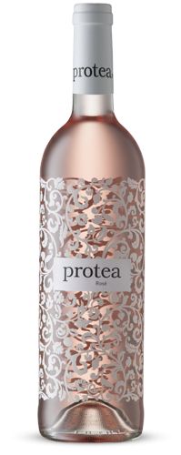
Typography, which is the style and appearance of printed matter (fonts and text), helps support the emotional pull of color theory which leads to the ultimate purchase decision. Typography can help bring in a specific style to a product which can help target a specific group of consumers. For instance, beer companies use darker colors to appeal to the beer drinkers, who, according to Chron.com, are mostly men between the ages of 18 to 49. Beer companies want a solid masculine package for their product. Men aren’t going to pick a case of beer that is covered in light pink hearts with text that looks like balloon letters. They will be drawn to the blue labels with the solid, thick text. It strengthens their “manly” side. The strengthening of their masculinity ism in turn, the relationship that is formed between the man buying the beer and the beer company themselves. In contrast, wine companies go for a more elegant font with more sophisticated color choices to appeal to the different target audience of wine drinkers.
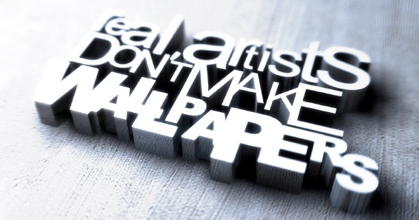
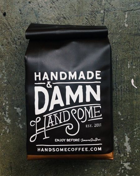
Below are a few examples of some interesting packaging. MarketingProfs.com does a great job of further explaining the effects of packaging. There’s an awesome info-graphic that walks you through all the elements!

Posted in Weekly Look | No Comments »
