doingword.com

Archive for February, 2017

DOTW- Jim Schindler

Thursday, February 16th, 2017

Jim Schindler is the man responsible  for the famous McDonald’s logo, although there were some others involved . The funny thing is that the logo that so many people recognize today wasn’t created until after McDonald’s had established itself a bit. Originally, the McDonald brothers,Richard and Maurice, wanted to have a new unique building that stood out and drew people in. They experimented with architectural elements which eventually lead to the golden arches which were simple aluminum arches painted yellow. Architect Stanley Metson helped design this first building.

Original McDonalds Building
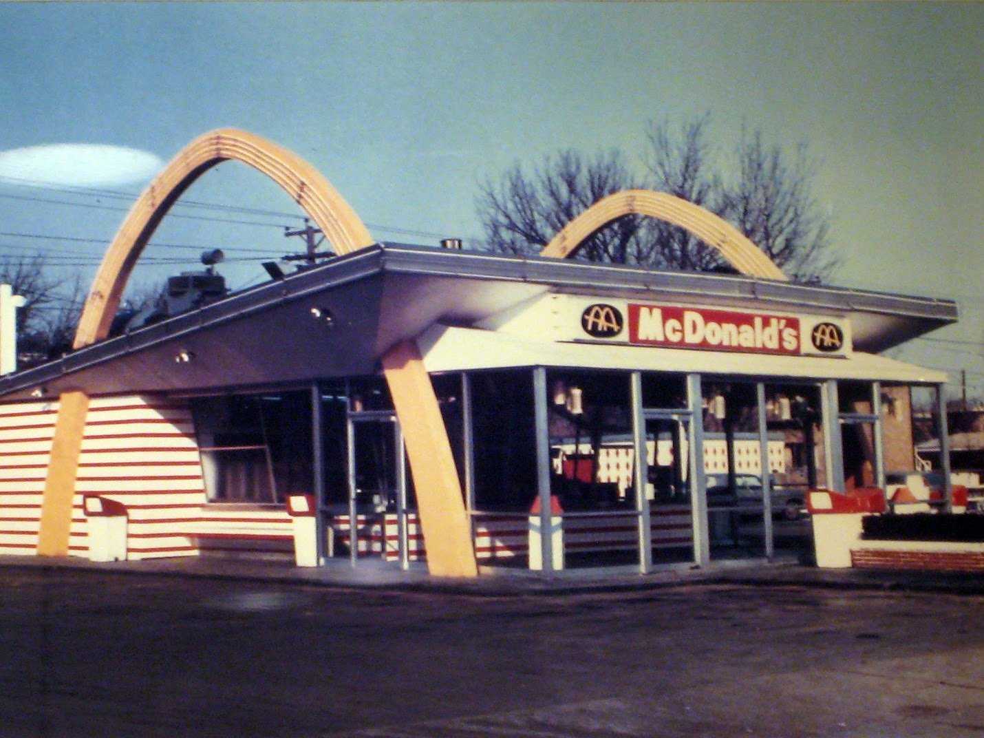
About 10 years later the need for a more “corporate logo” was becoming increasingly important. Richard McDonald had made a quick sketch of the original building arches which created an “M” when looked at at the right angle. This is where Jim Schindler comes in. Schindler drew inspiration form the already existing golden arches and created the current logo from that.

First ArchesThe arches were already so recognizable that it would’ve been silly to try to use anything different. Schindler’s design included the arches and a line running diagonally across to represent the original McDonald’s buildings that had slanted roofs.

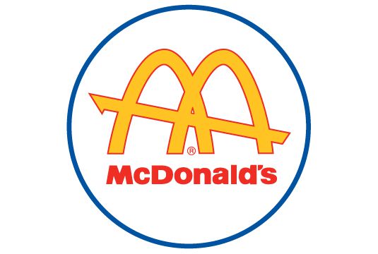
The logo does rely on color a bit. For most, we see the bright yellow “M” and automatically know what to expect because of the established relationship after many years buying food from them. If we were to look at the logo with colors other than the original yellow and red we would be slightly put off from it. Jim knew that the existing colors played a huge role in the brand and knew that people trusted that they could rely on McDonald’s, America’s burger restaurant, to deliver consistent quality every time they went in. The colors evoked a sense of trust and promise every time a customer saw them.

Original McDonalds

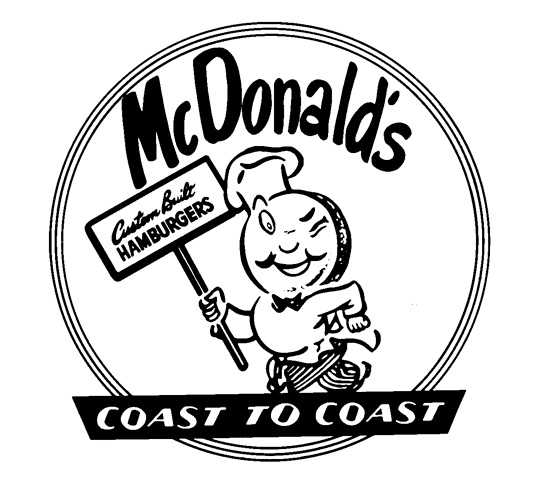
The original McDonald’s logo was an illustration of a hamburger man, named Speedee, but that was back in 1948. In 1961 the current arches logo had made it’s debut. The Speedee character had been used to help promote the ‘Speedee Service System’ that McDonald’s was providing which included deleting certain menu items to help improve their service times. The change to the arches logo had pushed McDonald’s relationship with America even further and is now recognized and trusted around the world.

Posted in Designer Of The Week | No Comments »

Food food food!

Thursday, February 16th, 2017

Food is all around us, which naturally means design is too because it usually has to go in something. Packaging plays a huge role in what we as consumers decide to buy. Some major elements that draw us in are typography, color and logos/icons. All these influences affect you, the consumer, subconsciously and according to Business Insider, it only takes 7 seconds to make a judgement based on this quick information provided by packaging.

Brands that use icons/logos are on the right path and know exactly what they are doing. When you see a logo, it creates an emotional connection in your mind and in turn starts to solidify a relationship between the brand and yourself. With that said, sharing images of products with other people makes it more likely that they will also chose that brand when they are in the same buying situation.

The visual aesthetic qualities are the main points I want to share with you. As mentioned before, color and typography play a huge role in catching the consumers attention and then causing them to make the final purchase decision.

Color theory is a concept of using color to evoke certain emotions and to cause a specific emotional response to something. For instance, red can be seen as an exciting color. Orange is viewed as friendly and welcoming. Green, a very common color used in packaging, promotes the idea of fresh ingredients and Eco-friendly products. You wouldn’t want to buy a juice drink that has a muddy dark label on it, would you? Instead, you’re going to reach for the one with the bright colors possibly including shades of green (back to that fresh ingredient concept).

Typography, which is the style and appearance of printed matter (fonts and text), helps support the emotional pull of color theory which leads to the ultimate purchase decision. Typography can help bring in a specific style to a product which can help target a specific group of consumers. For instance, beer companies use darker colors to appeal to the beer drinkers, who, according to Chron.com, are mostly men between the ages of 18 to 49. Beer companies want a solid masculine package for their product. Men aren’t going to pick a case of beer that is covered in light pink hearts with text that looks like balloon letters. They will be drawn to the blue labels with the solid, thick text. It strengthens their “manly” side. The strengthening of their masculinity ism in turn, the relationship that is formed between the man buying the beer and the beer company themselves. In contrast, wine companies go for a more elegant font with  more sophisticated color choices to appeal to the different target audience of wine drinkers.

Below are a few examples of some interesting packaging. MarketingProfs.com does a great job of further explaining the effects of packaging. There’s an awesome info-graphic that walks you through all the elements!
wine

handsome coffee

jalapeno jack food

Posted in Weekly Look | No Comments »

DOTW-Roger Dean

Saturday, February 11th, 2017

Roger Dean was born in Ashford, Kent on August 31, 1944. He spent his life moving around a lot because his father was in the British Army. He graduated from the Royal College of Arts, and has been living in East Sussex since 1972. Dean is responsible for many of the Yes album covers, in addition to Asia’s covers. I felt he was the perfect designer to look at because of the interesting style. It’s futuristic, colorful and full of energy while still causing a sense of calmness. Yes, a progressive rock band of the 60’s, shared music full of poetic lyrics instead of straight forward ones; this was the ‘progressive’ part of the band. These poetic elements are clearly seen in the album art. Strange hybrid creatures, unusual landscapes and environments, intense color; these are all very strong elements in Dean’s work. The band logo is the same psychedelic, expressive style.  His first album was for the Gun in 1968. It showed the same types of elements as seen in his Yes album designs. It had intense colors, strange creatures but instead of creating a sense of calmness as with the Yes albums, it had a feeling of chaos.

Dean was skilled in working with many different mediums. He uses watercolor, sketching painting, silk screening and even has done some architecture. You can read more about his innovative, ecofriendly designs here. Here are a few examples of the albums he created in addition to some of his paintings and other works. Note the common elements that Dean became famous for and see how he used them in each design. Here is The Online Roger Dean Gallery for more information about his work, life and where you can even buy items like books, t-shirts, mugs, posters and more!

Roger Dean Architecture

Roger Dean Painting 2

Yes Fragile

Roger Dean Painting 1

The album Dean design for Gun

Posted in Designer Of The Week | No Comments »

Genres and Logos

Saturday, February 11th, 2017

Design is involved in music in music in many ways but most commonly in CD cover art, gig/tour posters, album leafs and band logos. We’re going to take a look at some of the most popular bands and their logos and see how design played a role in their image!

The Doors

The Doors is one of the most well known bands from the late 60’s. You can feel the hippy counter-culture vibe in the trippy font used in “the”. “Doors” is kept simple and geometric to keep it from becoming too cliche with the hippy style. It is an iconic band that had an equally icon band logo!

Nirvana

Nirvana’s band logo has been used on t-shirts for over two decades! It is easily recognizable (as all logos should be!) and does an amazing job of showing the type of music the band plays. It gives a rock/alternative rock feel with the blocky but still stylized text and then the grunge with the doodle-like smiley face. After a little research, I learned that the smiley face was inspired by a strip club in Seattle. Something that seemed so simple and decorative can have a lot more meaning than you think. This is often the case in logos, but not always picked up on right away. To me, this is what makes design so fascinating; you can have the straight forward message then with further observation, you see hidden messages and meanings. I’ll save all this for a future post because honestly, I could go on and on!

Outkast

Alright, let’s switch gears and focus on a different genre. Outkast’s logo is spot on with their design! It carries an energy which reflects they’re upbeat and energetic songs. It also has a hip-hop feel due to the graffiti-like font that’s used. It’s a great way of hinting towards that style without literally copying it. Hinting to a specific style is a successful way of keeping a design full of character while still keeping it polished.


There ya have it! As I mentioned before, design is incorporated into the music industry in many other ways, these are just a few examples. Artist of the Week is coming up so check back soon and see who’s going to be featured this week!


Posted in Weekly Look | No Comments »

Search


type and hit 'enter'

Archives

  • February 2017
  • Links