Introductions
Game design is one of my biggest passions. I think it’s a massively underappreciated art form. However, this is an opinion I didn’t develop until the end of my time in high school, towards the beginning of my college years.
Much of this realization and appreciation can be traced back to one game – Hyper Light Drifter, an indie game developed by Heart Machine. After I had played through Hyper Light Drifter for the first time, everything suddenly clicked – I felt that I finally understood game design.
But that statement begs an important question . . .
What is Game Design?
In my opinion (and my own words), game design can be defined as:
A set of fundamental rules and design philosophies that revolve around teaching players the rules and mechanics of your game through intuitive design choices.
Much like movies can communicate character personalities and development through the framing, composition, and color choices within a particular shot (among other things, of course), video games, as an interactive medium, can communicate similar concepts and information through GAMEPLAY.
Although certain broad, more vague game design concepts can be applied universally across all video games, the particulars of game design tend to vary between genres.
Turn-based Role Playing Games, for example, tend to follow a slightly different set of rules than First Person Shooters, and the implications of specific design choices for gameplay within those genres vary.
Regenerating health has different consequences on gameplay in an RPG than it does for an FPS. In the former, it would be slightly unbalanced, unless you designed around it, while regenerating health is a fairly common design choice in the latter.
The Plague of AAA Gaming
If you’ve ever played a modern AAA (“Triple A”, i.e. developed by a major company) video game, you’ve probably experienced what I refer to as ‘the plague of AAA games.’ This is a rather broad phrase I use to refer to common ‘gaming sins’ committed by AAA developers.
This is an extremely huge topic – one that I could very realistically write an entire book about – but I’ll spare you the details and keep things concise.
Simply put, this phrase refers to a trend where AAA developers eschew and/or completely ignore basic, fundamental game design concepts (Game Design 101, if you will). Some of these ‘sins’ are fairly subjective (lots of people enjoy games that I consider to be extremely flawed on a fundamental level), though I would argue that, in just about any case, a game which avoids these mistakes is going to be more enjoyable than one that doesn’t.
It should go without saying that indie developers can be guilty of these mistakes as well. The reason I commonly associate these mistakes with AAA developers is because they have more resources (money) to hide their mistakes. Indie developers simply do not have the resources to hide their mistakes behind pretty graphics, visual flair, and/or A-list voice actors.
Misuse of Tutorials
Misuse of tutorials is perhaps the most common symptom of the AAA plague. As I’m sure most of you are already aware, a “tutorial” is the part of a game wherein the player is taught how to play the game.
More often than not, modern video games will simply throw the player into an abstract, unrelated section of gameplay, where button prompts appear on-screen informing the player of their function when they become relevant.

Even a well-designed game like Hyper Light Drifter is guilty of this. The necessity of tutorial prompts is a commonly debated topic in the modern gaming industry.
Personally, I think these prompts are redundant, and condescending. I do not believe that any well-designed game needs these prompts – I’m a purist. At the very least, there should always be an option to turn them off.
Referring to my previous definition of “game design,” this mistake overlooks the importance of intuitive design choices. Clever developers will make an effort to integrate their tutorial segment(s) seamlessly into gameplay. Again, I could talk about this one thing for hours, but I’m going to keep things brief, here.
If you’d like a more flavorful, in-depth analysis of the sort of thing I’m talking about, refer to Arin Hanson’s “Sequelitis” episode about the introduction stage in Mega Man X.
Please keep in mind that Arin curses a lot – if that sort of thing bothers you, well.. There’s your warning. I think his analyses are extremely well-formed and cogent, and well worth taking into consideration, if you’re interested in or passionate about game design.
These videos are also really funny, and enjoyable to watch – even if you don’t care about game design. Please note that the video is age-restricted, so you’ll have to watch it on YouTube.
0:00 – 5:14
contains the section(s) of the video most relevant to what I’m talking about with this post.
Hyper Light Drifter
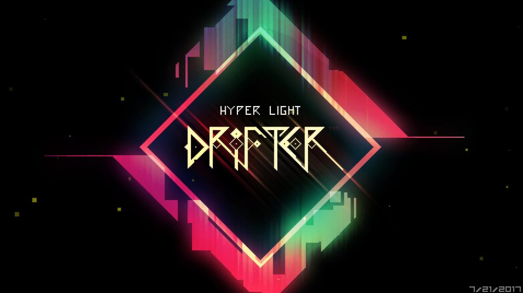
Okay, so.. What exactly does all of that have to do with Hyper Light Drifter? Well.. simply put, Hyper Light Drifter, through its use of intuitive design choices and fundamentally sound game design, taught me how to play video games.
After years of playing AAA games fairly mindlessly, and often feeling confused whenever I picked up a new game, I entered Hyper Light Drifter with a fresh mindset.
I can’t honestly remember what sparked my sudden desire to try a new method of learning and playing video games, but I can distinctly recall that I wanted to go into Hyper Light Drifter completely blind – meaning I would play the game without any prior knowledge about its gameplay or story, and learn through trial and error.
As it turns out, Hyper Light Drifter was perhaps the best possible game I could have decided to do this with, because Hyper Light Drifter is an entirely NON-VERBAL game.
Game Design as a Replacement for Language
Hyper Light Drifter has no written or spoken English in it whatsoever, save for the (relatively non-intrusive) tutorial prompts that introduce you to the most basic mechanics (how to swing your sword, use items, etc.) at the very start of the game.
As you can imagine, this makes game design extremely important. The developers of Hyper Light Drifter did not have the option to explain the mechanics of the game in plain English – they were forced (by virtue of their own decisions) to teach players how to play their game through its gameplay.
!!! N O T E !!!
In the interest of avoiding spoilers, I won’t be discussing anything beyond the tutorial sequence of Hyper Light Drifter.
This game is $20 on Steam, $25 if you purchase the Soundtrack, which you most definitely should (unless you decide to listen to it on Spotify). Buy it, and play it. You will not regret it.
I will not be spoiling this game.
A Brief Example
Again, referring to my previous definition of game design, keep in mind that it revolves around the communication of mechanics and gameplay elements through intuitive design choices.
In other words, these shouldn’t be overly obtuse or difficult to understand. More often than not, good game design revolves around universal (often instinctual) concepts.
Referring back to Arin Hanson’s “Sequelitis” episode about Mega Man, he brings up the visual design of a particular screen in Mega Man 2‘s Quick Man stage.
“Mega Man 2, I’m sure you all know this.. Quick Man’s stage has this segment where you just start droppin‘. But right away, there’s these big yellow beams that are like, ‘BWOOOOOEUUU’ . . . Look, the stage is shaped like a funnel, so it draws me towards the bottom – so I’ve got no problem feelin’ there some tension in escapin’ these obnoxiously loud death beams . . .” (Sequelitis, 3:29).
Notice how no text-prompt or written explanation was necessary to deliver this information, and the information was delivered in such a way that the player being punished for their ignorance is highly unlikely?
That’s game design. A set of (often invisible) techniques developers use to guide you through their game.
This step of tutorializing through gameplay is what I (and Arin Hanson, among others I’m sure) refer to as,
Introducing concepts in a controlled (safe) environment.
Let’s apply this concept across the brief tutorial section of Hyper Light Drifter, and see how the game utilizes game design to communicate its mechanics.
Hyper Light Drifter’s Tutorial
This post has already gotten pretty long, so I’ll be keeping things fairly concise, here. Most of these examples are also fairly self-explanatory, since they are – by virtue of being well-designed – very intuitive.
All of these screenshots were taken by me, via Steam.
I did not create Hyper Light Drifter.
1. The Very Beginning (Movement and Visuals)
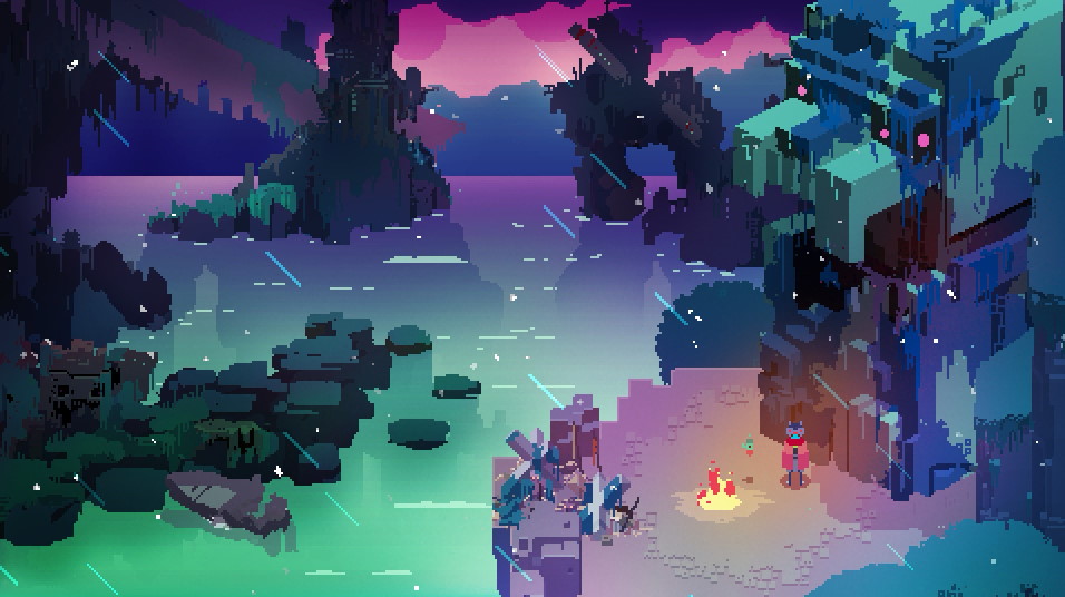
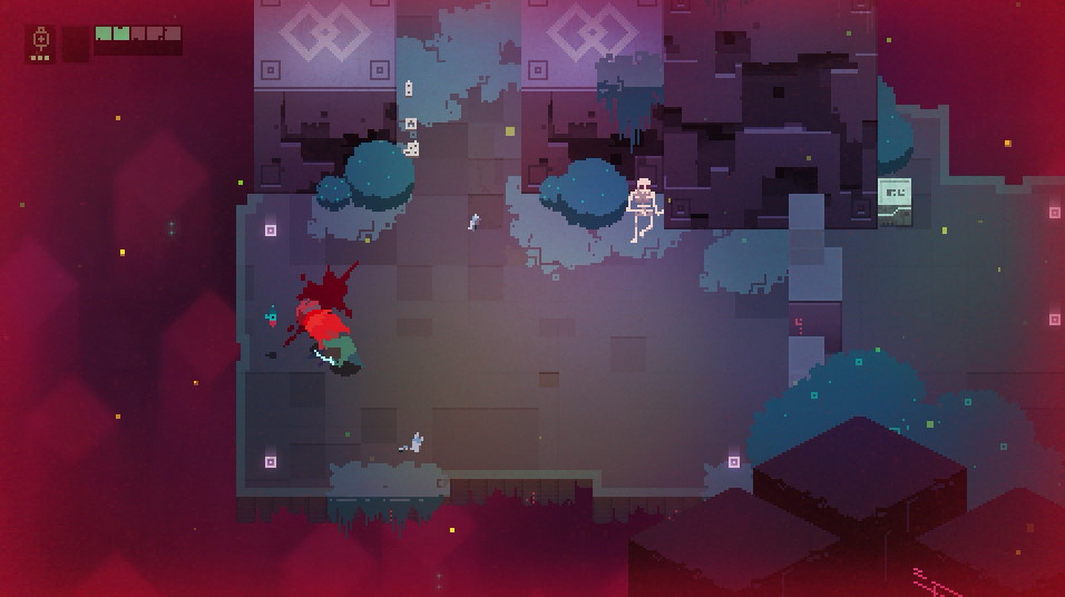
This is the screen where the player awakens (Fig. A). In addition to providing an immediate introduction to the (beautiful) visual style of the game, the player is granted immediate control over their character.
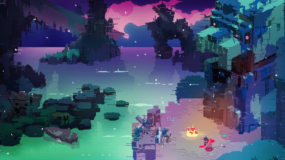
However, upon trying to move for the first time, the player character, known as the “Drifter,” begins to cough violently, spewing blood across the ground (Fig. B). This introduces players to the sickness that will follow them throughout the game.
2. Progression and Obstacles (Interacting with the Environment)
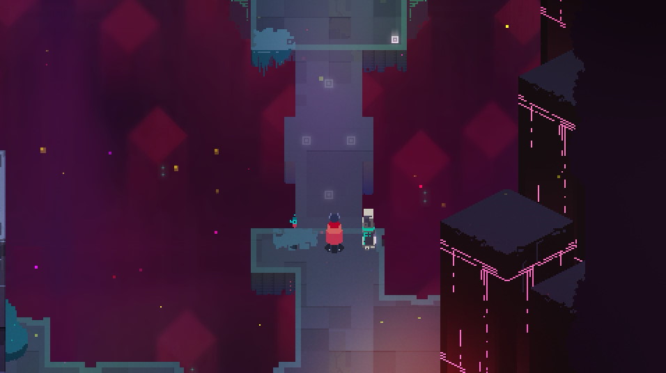
Note that the level design and shot composition draw the player’s eyes towards the lower-right region of the screen. This subconsciously encourages players to travel downwards in order to progress (Fig. A).
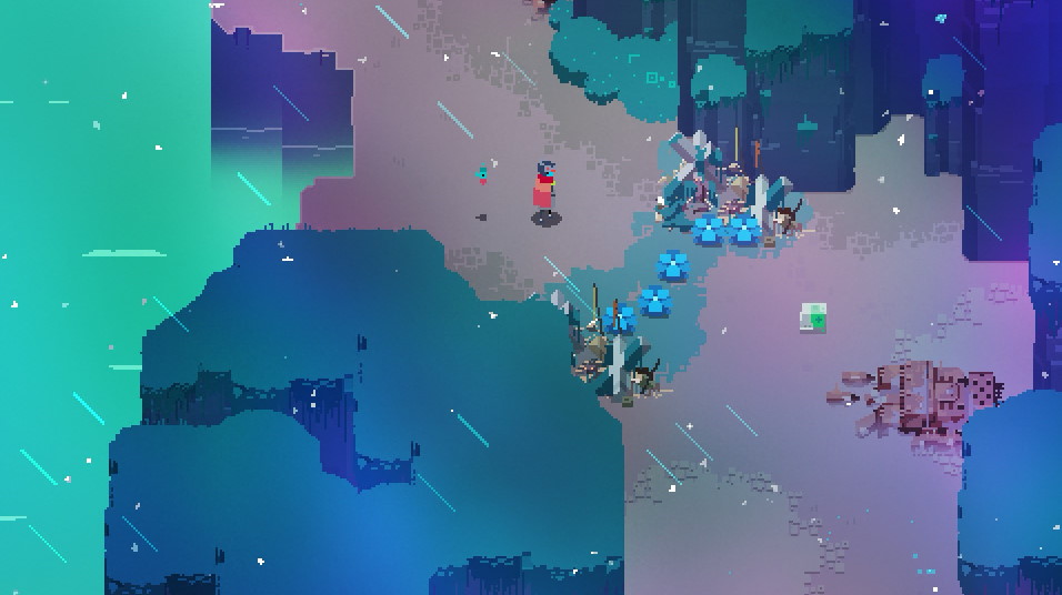
The player then runs into a line of grass blocks that cannot be walked over (Fig. B). If the player experiments with the controls (i.e. they start pressing random buttons), they will discover that one of the buttons will allow them to swing their sword (Fig. C). This introduces players to the ability to attack, and the removal of obstacles through attacking.
The medkit to the right (Fig. C) can also be picked up, and used to recover lost health.
3. Elaborating on Movement (Dashing)
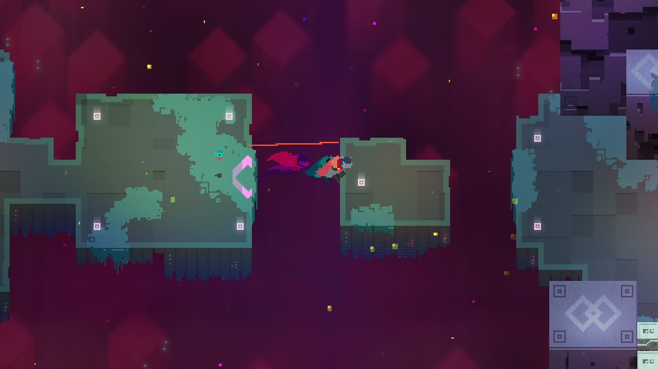
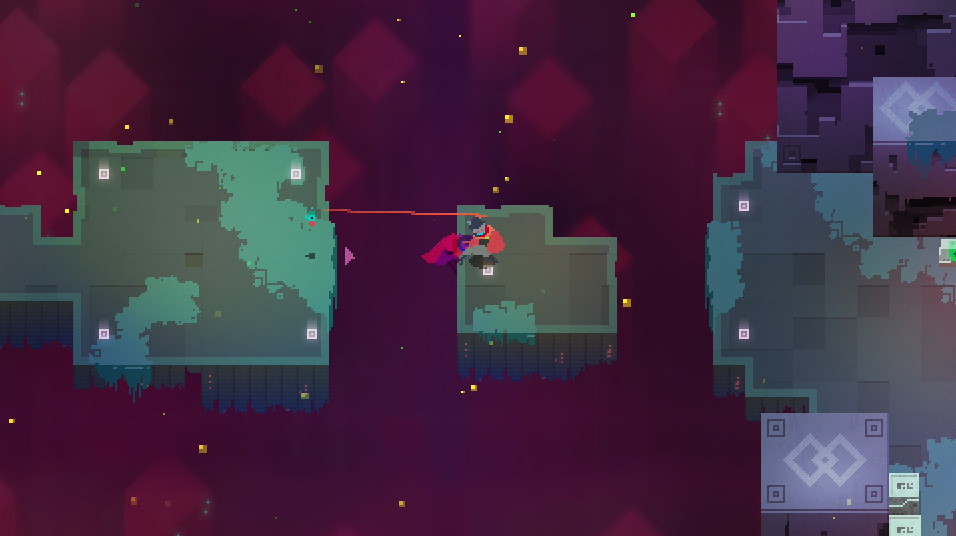
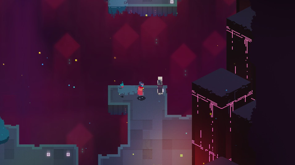
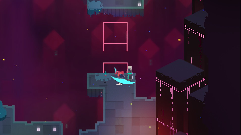
After taking an elevator into the underground region of the map, the player is faced with a sizeable gap. By this point, the player will have already learned that they can dash. Using the dash at the edge of the platform will allow players to clear the gap (Fig. A & B).
This introduces the concept of using your dash for exploration, which will become important later on, when collectibles and upgrades are hidden in secret portions of the environment.
4. Introductions to Danger (Enemies and Combat)
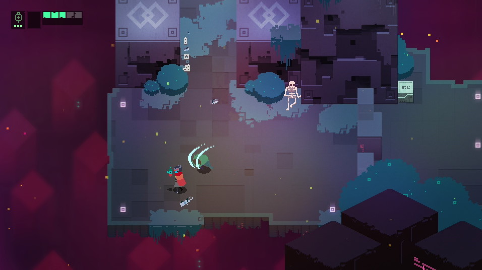
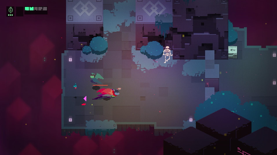
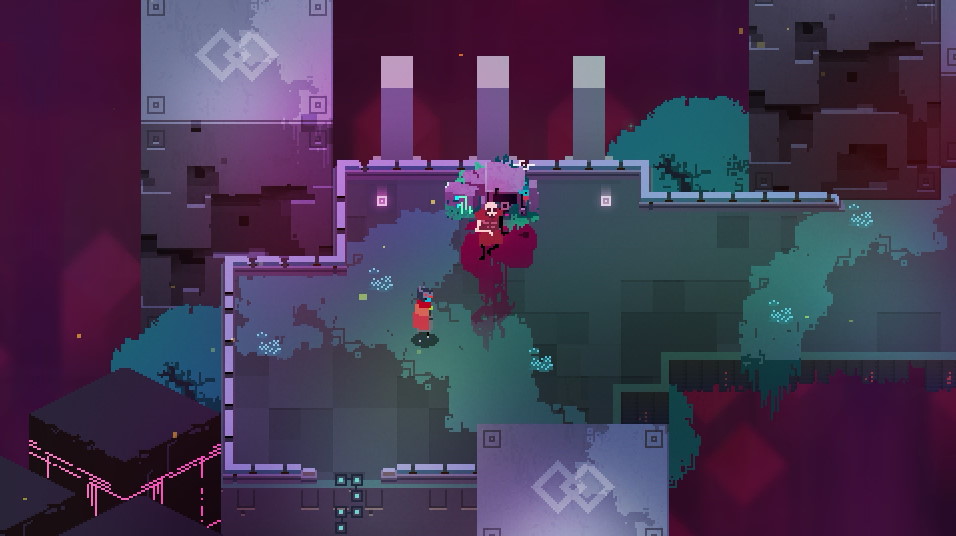
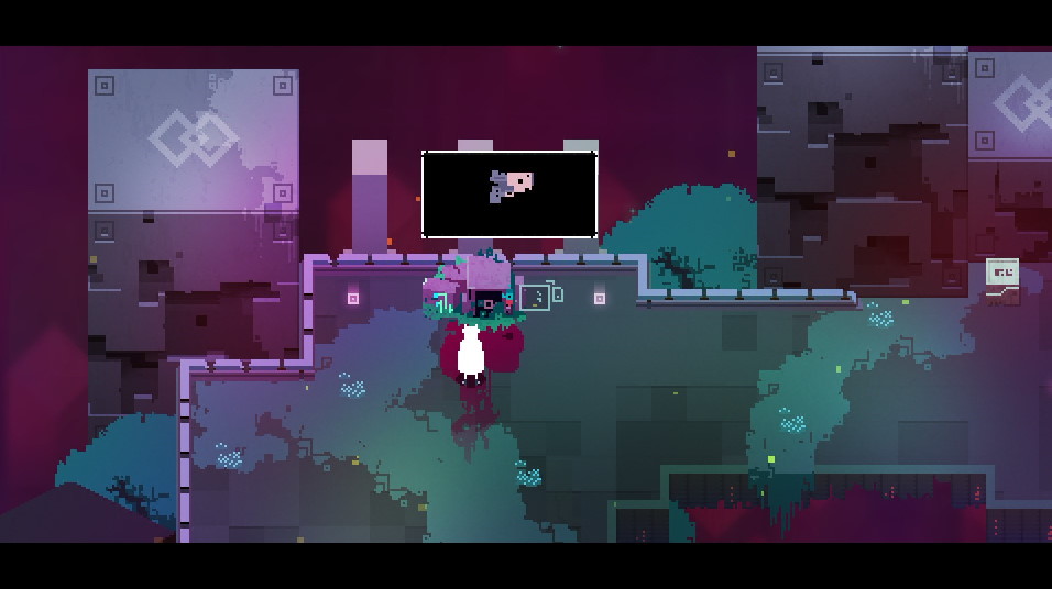
Next, the player is funneled into an arena with the most basic enemy type in Hyper Light Drifter, the Dirk (Fig. A). Most of the arena is closed in, but it is possible to accidentally dash off the open ledges, which will deal 1 point of damage. This introduces players to fall damage, and the importance of paying attention to their environment.
Still, this is a relatively controlled environment, and Dirks only have one type of attack (Fig. B).
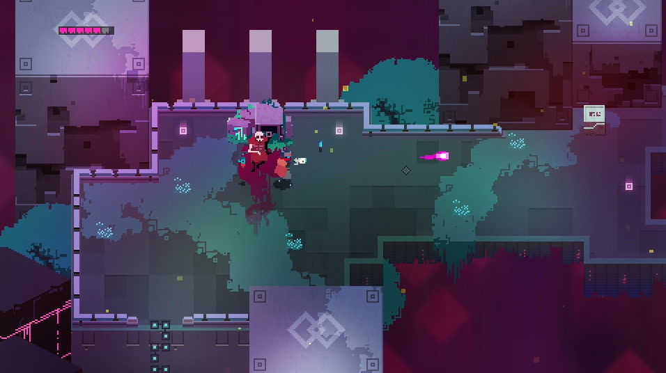
Most players will naturally use their dash in order to escape danger (Fig. C), since it’s a movement mechanic they’ve been encouraged to use multiple times, by now. This introduces players to the importance of mobility in combat.
If players take damage (Fig. D) enough times, they’ll die, and be introduced to the consequence/punishment for death. You simply respawn at the last checkpoint, which is rarely far away.
5. Opening New Pathways (Activating Switches)
After fighting the Dirk, players will happen upon a red, glowing pillar, next to a gap that’s much too large to dash across (Fig. A).
Since the amount of mechanics the player has been introduced to is fairly small, the only real option here is to strike the switch with the sword (Fig. B).
This will activate the switch, turning it green – a color which generally signifies ‘go’ – and create a pathway for the player to walk across (Fig. C).
These stimuli introduce players to switches, and how they can be used to progress throughout a level.
6. Diversifying the Combat Moveset (Getting a Gun)
After progressing a bit further through the level, the player will walk into a corpse, which is glowing in an unusual manner (Fig. A).
Interacting with the corpse will reward the player with their first gun (Fig. B).
This introduces players to glowing corpses, which always have some sort of important treasure or upgrade.
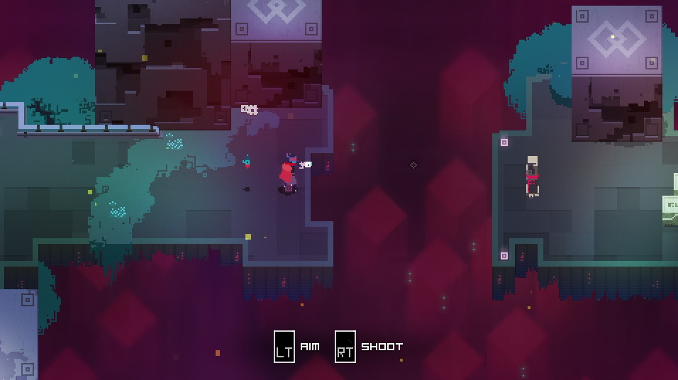
Guns, as a concept, are pretty self explanatory. You use them to shoot things (Fig. C). On a controller, the buttons used to activate the gun are called “triggers,” which makes them a fairly intuitive choice for gun controls (since guns also have triggers).
However, in Hyper Light Drifter, guns also have a secondary use. They can be used to activate switches that are too far away to strike with the sword (Fig. A & B). This elaborates upon the previously introduced mechanic of switches.
It’s also worth noting that the switch shown in the above examples is located immediately after the player receives the gun. As such, the gun will be fresh in their mind, and will likely be the first solution the player thinks of, in order to activate the faraway switch.
7. Upping the Difficulty (Groups of Enemies)
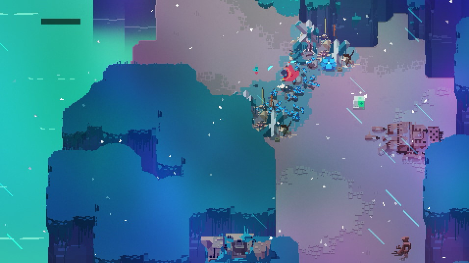
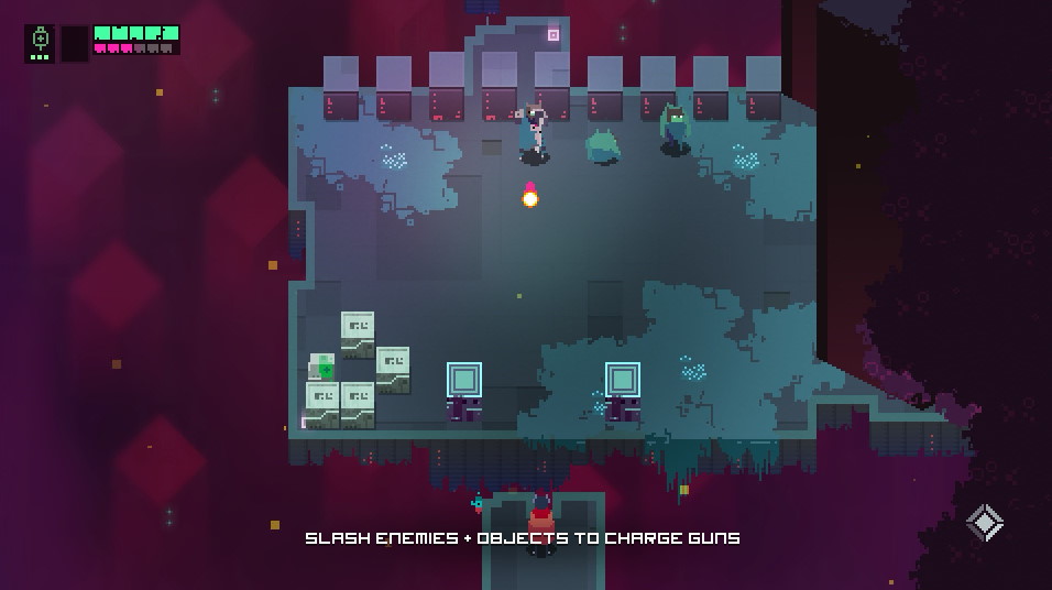
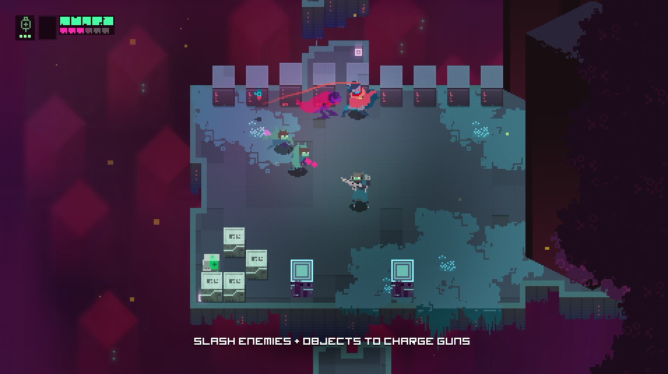
Your final challenge in the tutorial is to fight a group of enemies. One of the enemies is a new enemy type, the Dirk Rifleman (Fig. A). This is a fairly weak enemy that, much like the Dirk, only has one attack – firing its rifle.
Since this enemy is extremely simple, and utilizes a ranged weapon (a concept the player has already been introduced to), there’s no need to introduce the Dirk Rifleman by itself. Instead, the player is introduced to fighting groups of enemies (Fig. B).
This fight also tests your reflexes, and analyzes how fast you’re able to react and respond to enemies with new attack patterns.
8. Gorgeous View Ahead (The Central Town)

After ascending from the underground, the player is granted with an absolutely gorgeous view of the nearby Central Town, which will become a ‘hub’ of sorts after completing the tutorial segment.
And with that, the tutorial is over, and players are thrust into the world of Hyper Light Drifter, where all of the mechanics highlighted above will be utilized and elaborated upon.
Conclusion
Through its intuitive gameplay mechanics, and well-designed tutorial segment, Hyper Light Drifter displays the careful intention of its developers.
Although the game does provide players with (relatively non-intrusive) tutorial prompts throughout the introductory section, I think such prompts are largely unnecessary.
If you want to know how to do something in a game you’ve never played before, try pressing buttons. Worst-case scenario, you die in-game, and come back to life. Your consequences for experimentation in a video game do not extend into the real-world – do not be afraid to press buttons and experiment.
I have truly only scratched the surface when it comes to describing the exhaustive level of detail and deliberation that went into designing this game – I cannot recommend this game enough.
Hopefully this post has given you a greater degree of insight and appreciation for game design, and the invisible design choices that guide players throughout new experience(s).
And as always, thanks for reading.
Disclaimer
All information in these posts is my own words, unless explicitly stated otherwise. None of this information is quoted, nor paraphrased, unless explicitly stated otherwise. Any similarities between my own words, and the informative sources/hyperlinks provided is purely coincidental, unless explicitly stated otherwise.
In any case where I am using someone else’s words (or imagery), the source will be cited internally, with a link to that source provided either within the internal citation, at the end of the post under “Sources,” or both.




March 28, 2021 at 9:11 pm
Great post! I would say the game series that is teaching me how to play games right now is the Monster Hunter series. It’s teaching me to rethink my approach to how I play games. Instead of rushing in headfirst, it’s teaching me to think ahead and play more methodically. Some of the monsters in-game are daunting to beat, but I’ve had a lot of fun doing so. It makes me appreciate the thought and effort put into the series overall game design.
March 29, 2021 at 5:02 am
Monster Hunter is a great series of games for that. The nature of the game forces you to approach each fight carefully. Even those who might be cocky going into certain fights will likely feel intimidated by some late-game monsters, forcing them to take a more careful approach to combat.
May 8, 2024 at 7:06 am
Kepala Bergetar Tonton Online Dfm2u Drama Malaysia Dan Filem Melayu Full HD Episod. Tonton Kbergetar Semua Telefilem Terkini.
Kepala Bergetar
June 23, 2024 at 3:31 pm
Es un placer leer su blog de vez en cuando. Felicitaciones desde el portal web con herramientas financieras como la nueva calculadora de interés compuesto
July 24, 2024 at 2:57 am
Wow, Hyper Light Drifter sounds like a fascinating Retro Bowl College game, especially with its focus on intuitive design. I had never heard of it before, but your explanation makes me want to give it a try!
August 26, 2024 at 7:32 am
great thanks for sharing it is really nice you can join papa louie it will give you many unexpected experiences
October 31, 2024 at 8:23 am
For every person, a real love calculator will have different significance. Our love calculator is meant to give every pair real and realistic findings.
November 27, 2024 at 8:41 am
Not a bad game. The graphics are rather unusual for the present times.
December 2, 2024 at 8:20 am
Thanks for sharing; I found a lot of intriguing information here. A really good post. driving directions
January 11, 2025 at 4:58 am
The engaging gameplay of Abgerny Incredibox makes you feel connected to the music as you build each beat.
January 13, 2025 at 2:38 am
Block Blast Puzzle is a captivating puzzle game that combines strategic thinking, skillful planning, and rewarding progression to keep players engaged for hours.
January 15, 2025 at 10:36 am
This title’s striking, dark visual and haunting soundtrack immerse the player in a demon-infused, intense experience that requires precision, patience, and a persistent desire to overcome its sadistic, soul-crushing stages.
March 1, 2025 at 1:00 pm
The NYT Sudoku Medium puzzle offers a balanced challenge for players who have mastered the basics and want to level up their skills. While the rules remain the same filling a 9×9 grid so that each row, column, and 3×3 box contains the numbers 1 through 9 without repetition the clues are more strategically placed, requiring deeper logic and pattern recognition. Techniques such as pencil marking, candidate elimination, and naked pairs become essential to progress. This difficulty strikes the perfect middle ground, providing a satisfying mix of logic, strategy, and problem-solving without being overwhelming.
March 5, 2025 at 11:49 am
Thank you for sharing good article will be connecting with you.
March 13, 2025 at 9:25 am
The combination effect in Suika game is extremely cool: when combined, the fruit will roll, bounce, creating unexpected and fun “combo” phases.
March 15, 2025 at 9:36 am
Hyper Light Drifter is an incredible game that blends fast-paced combat, exploration, and stunning pixel art with a deep, Geometry Dash Lite wordless narrative.
March 15, 2025 at 10:09 am
Adobe Lightroom APK is a widely recognized internet software, used by countless individuals worldwide.
March 24, 2025 at 2:51 am
Hyper Light Drifter is a masterpiece of art with beautiful graphics, engaging gameplay, and an emotional story. This game offers such a unique experience that even Drift Boss would be jealous of its magical “drifter” style. An indie game worth experiencing and cherishing!
March 24, 2025 at 11:12 am
I appreciate you sharing this excellent article and will get in touch with you. level devil – not a troll game
April 24, 2025 at 3:30 am
This platform offers a compelling range of features that seem perfectly suited to our needs. Here’s the link if you’d like to dive in. k11bet
May 2, 2025 at 4:40 am
I wouldn’t usually bookmark something like this but this one felt different. Could be a hidden win. Check it out if you’ve got a minute. 24kbet
May 3, 2025 at 10:09 am
Thank you very much. papa’s games
May 7, 2025 at 4:53 am
speed stars takes players to a thrilling running game where accuracy, timing, and rhythm dominate the course. Each tap directs your athlete’s stride, and executing perfect combinations generates unstoppable speed. It’s not merely about racing fast; it’s about mastering the rhythm and testing your reflexes to the max.
May 7, 2025 at 6:19 am
This is a great introduction to game design principles! I agree, interactive gameplay is key to conveying information. Thinking about the simple mechanics in games like Papa’s Pizzeria , where you learn order-taking and pizza-making through repetition, illustrates your point perfectly. It shows how even seemingly basic games use intuitive design to teach players and keep them engaged. This makes me think more deeply about what goes into making a successful game.
May 7, 2025 at 9:45 am
A well-designed game communicates its systems without overwhelming the player, much like how films use visual language to convey character development without dialogue.
May 14, 2025 at 11:58 pm
Chill Guy Clicker lets you hang out with the beloved Chill Guy while you tap away to rack up points.
May 17, 2025 at 8:34 am
The thoroughness of your analysis is truly impressive. I admire your ability to convey such detailed information in an accessible way. merge fellas
May 28, 2025 at 3:17 pm
Thanks For sharing this Superb article.I use this Article to show my assignment in college.it is useful For me Great Work. Pragmatic demo
June 2, 2025 at 10:43 am
Nice Post, This is really an amazing content very helpful Gamma Emerald
June 2, 2025 at 4:00 pm
Bring the captivating beauty of Dragon Glass to your garden. Our healthy cannabis clones offer an accelerated grow cycle and reliable performance. Enjoy its unique effects and dazzling appearance. Order your clones today! dragon glass clones
June 7, 2025 at 4:12 pm
A really positive review. I am definitely going to look into that. Speed Stars
June 7, 2025 at 4:13 pm
An extraordinarily positive assessment would be appropriate. That is something that I will definitely look into. Speed Stars
June 17, 2025 at 3:18 am
Honestly, I thought I was ready for anything, but this game had me screaming more than once. The way the enemies moved, the eerie silence between scenes, and the sudden bursts of terror were all done brilliantly. It’s clear that the developers know exactly how to play horror games. It’s scary in all the right ways.
June 19, 2025 at 8:50 am
Stickman hook is a swinging game that requires timing and skills to attach the hook and complete 100 levels.
June 21, 2025 at 8:43 am
Visit Wacky Flip to start your incredible acrobatic journey, share your top flips with friends, and climb the global leaderboard today!
June 29, 2025 at 11:18 am
Nice Informative Blog having nice sharing.. Tentoto
June 30, 2025 at 9:09 am
Thank you for taking the time to publish this information very useful! Tentoto
June 30, 2025 at 9:06 pm
I genuinely believed I could handle whatever came my way, but this game caught me off guard and had me yelling out loud multiple times. clicksud.com.co
July 3, 2025 at 7:06 pm
Alpine Fleet offers a flexible booking system, allowing amendments to reservations online. This adaptability is great when travel plans might change, providing added convenience and peace of mind. Geneva Ski Transfers
July 8, 2025 at 6:01 pm
i read a lot of stuff and i found that the way of writing to clearifing that exactly want to say was very good so i am impressed and ilike to come again in future.. Tentoto
July 13, 2025 at 5:52 pm
For users requiring significant bandwidth, Lyra Hosting’s dedicated streaming servers are an ideal solution. With unmetered options from 1Gbps to 10Gbps, they support high-demand content delivery without limitations. anonymous offshore hosting solution
July 15, 2025 at 7:29 pm
For dogs prone to allergies, PetzPark Probiotics offer crucial immune support. By nurturing a healthy gut, this supplement can help reduce allergic reactions, contributing to a more comfortable and happy life for your sensitive pup. Choose the best Petzpark probiotic formula for your dog or cat
July 18, 2025 at 12:57 pm
Great! It sounds good. Thanks for sharing.. Toto Macau
July 19, 2025 at 8:55 am
Page and would like you to stay informed about news updates. and provide up-to-date content so we can read them constantly level devil.
July 19, 2025 at 5:19 pm
Great! It sounds good. Thanks for sharing.. Tentoto
July 20, 2025 at 9:42 am
I appreciated your work very thanks Bandar Togel
July 22, 2025 at 8:14 am
This is such a great resource that you are providing and you give it away for free. I love seeing websites that understand the value of providing a quality resource for free. It is the old what goes around comes around routine. Tentoto
July 23, 2025 at 8:27 am
What is the longest subway surfers record that you can achieve? Collect power-ups and surf your way through the track.
July 24, 2025 at 8:49 pm
I appreciated your work very thanks Tentoto
July 26, 2025 at 8:02 pm
Nice Informative Blog having nice sharing.. Tentoto
July 30, 2025 at 3:18 pm
Thanks for sharing the info, keep up the good work going…. I really enjoyed exploring your site. good resource… Tentoto
August 2, 2025 at 4:51 pm
Thanks for sharing the info, keep up the good work going…. I really enjoyed exploring your site. good resource… jnetoto
August 4, 2025 at 8:19 am
thank you for a great post. Tentoto
August 5, 2025 at 3:44 pm
Great post I would like to thank you for the efforts you have made in writing this interesting and knowledgeable article. Tentoto
August 6, 2025 at 6:12 am
Thank you very much. papa’s games
August 6, 2025 at 11:56 am
thank you for a great post. Tentoto
August 7, 2025 at 10:41 am
Thanks for your information, it was really very helpfull.. Tentoto
August 8, 2025 at 1:36 pm
thank you for a great post. Tentoto
August 10, 2025 at 9:12 am
Thanks for the valuable information and insights you have so provided here… Tentoto
August 12, 2025 at 11:06 am
Nice Informative Blog having nice sharing.. Tentoto
August 16, 2025 at 7:51 pm
This is very educational content and written well for a change. It’s nice to see that some people still understand how to write a quality post! Tentoto
August 20, 2025 at 4:41 am
Your reflection on ‘Hyper Light Drifter’ beautifully captures how a game can transcend entertainment to become a personal journey
August 23, 2025 at 6:47 am
This info is really appreciated. All of your blog posts are excellent. An informative and entertaining blog entry has been made available to the world by you. Play the free online redactle game.
August 25, 2025 at 2:23 pm
Your breakdown of non-verbal, intuitive game design in Hyper Light Drifter is spot-on—it’s the kind of elegant teaching-through-play I aspire to in Creepy Dates
August 27, 2025 at 7:22 pm
I was worried about a recent health inspection, but Premier Grease provided fantastic service. They cleaned our entire exhaust system and gave us documentation with before-and-after photos, which was exactly what we needed. restaurant hood cleaning in Atlanta
August 27, 2025 at 9:35 pm
This is very educational content and written well for a change. It’s nice to see that some people still understand how to write a quality post! idncash
August 29, 2025 at 7:30 am
First Person Shooters, and the implications of heartlandrenew specific design choices for gameplay within those genres vary.
August 29, 2025 at 4:06 pm
i read a lot of stuff and i found that the way of writing to clearifing that exactly want to say was very good so i am impressed and ilike to come again in future.. pasaran cambodia
September 5, 2025 at 8:34 am
For anyone searching for reliable betting platforms, I usually log in through hi88 đăng nhập without issues. hi88
September 6, 2025 at 9:11 pm
thank you for a great post. tentoto
September 10, 2025 at 8:16 am
I was impressed with how easy it was to get started. The setup was quick, and my offshore web hosting was up and running in no time. The process was simple and straightforward. Best offshore VPS hosting
September 12, 2025 at 10:32 am
This post is the perfect combination of informative and accessible. You’ve taken care to ensure that readers can actually learn from what you’ve written daily pay
September 13, 2025 at 8:42 am
Thanks for sharing the info, keep up the good work going…. I really enjoyed exploring your site. good resource… TENTOTO
September 14, 2025 at 2:16 pm
Thanks for the post and great tips..even I also think that hard work is the most important aspect of getting success.. TNTOTO
September 15, 2025 at 8:48 pm
This is very educational content and written well for a change. It’s nice to see that some people still understand how to write a quality post! bokep
September 16, 2025 at 6:38 pm
Your website is really cool and this is a great inspiring article. Thank you so much. lombaqq
September 18, 2025 at 9:04 am
Terima kasih atas pembaruannya, situs yang sangat bagus. dewapokerqq
September 18, 2025 at 4:02 pm
Blog yang bagus dan informatif, berbagi dengan menyenangkan.. jepangqq
September 18, 2025 at 4:14 pm
Great! It sounds good. Thanks for sharing.. tentoto login
September 18, 2025 at 9:34 pm
Businesses gain strength by enhancing Briansclub credit.
September 19, 2025 at 1:02 pm
Terima kasih atas informasinya, sangat membantu.. gocengqq
September 22, 2025 at 2:53 pm
Your analysis of Hyper Light Drifter’s intuitive, non-verbal game design perfectly captures how great games teach through experience—much like the complex musical layers in Incredibox Unforgiven , the best interactive media communicates its essence through pure, unspoken understanding rather than explicit instruction.
September 23, 2025 at 2:10 am
This blog is built as a technology-driven platform to share valuable insights, deliver diverse knowledge, and provide readers with an objective perspective. Our content focuses on curating, analyzing, and presenting information in a transparent and accessible way, helping you explore high-quality resources across multiple fields
September 23, 2025 at 9:52 am
Passionate about technology and digital innovation, I am always exploring solutions that enhance user experience and deliver real value. With a strong background in digital marketing, SEO, and emerging tech trends
September 23, 2025 at 10:36 am
Passionate about technology and digital innovation, I am always exploring solutions that enhance user experience and deliver real value. With a strong background in digital marketing, SEO, and emerging tech trends
September 24, 2025 at 4:15 pm
Thanks for your information, it was really very helpfull.. tentoto
September 29, 2025 at 8:34 am
steal a brainrot is a fun, chaotic multiplayer Roblox loot game developed by Brazilian Spyder, where you collect quirky Brainrot meme characters by buying or stealing them from other players.
October 7, 2025 at 10:35 am
siixgame is an online Teen Patti Game in Pakistan that allows players to make money. It has multiple mini-games like Thunder Fire Tiger, Rocket Cash, Dragon, and many more.
October 8, 2025 at 1:33 pm
Moving long-distance from Newfoundland to Alberta felt overwhelming, but the outstanding service made it stress-free. Our belongings arrived in perfect condition, even after three months in storage. Five stars for their attention to detail and care! Cheap movers Edmonton prices
October 9, 2025 at 3:42 pm
i read a lot of stuff and i found that the way of writing to clearifing that exactly want to say was very good so i am impressed and ilike to come again in future.. tentoto
October 12, 2025 at 5:00 pm
This is very educational content and written well for a change. It’s nice to see that some people still understand how to write a quality post! agen togel
October 14, 2025 at 8:45 pm
I read a lot of stuff and i found that the way of writing to clearifing that exactly want to say was very good so i am impressed and ilike to come again in future.. agen togel
October 16, 2025 at 8:56 am
What a powerful reflection — your journey of realizing game design through Hyper Light Drifter resonates deeply.
I love how you articulate the difference between telling and teaching through play — that intuitive design is magic.
Thank you for sharing such a thoughtful perspective; I’ll be passing this along to AimGrip readers.
October 27, 2025 at 7:27 am
Totally agree, game design is such an art! HLD sounds like a pivotal moment for you. It’s cool how a game can help you understand yourself and your passions better. Makes you wonder what an online personality test might reveal about your *actual* personality traits, doesn’t it?
October 29, 2025 at 4:21 am
Hyper Light Drifter truly showcases how intuitive design can replace lengthy tutorials. The blood-coughing scene teaches mechanics while building atmosphere—genius! More games should embrace this “show, don’t tell” approach.
November 3, 2025 at 4:39 am
I’m blown away by the quality and depth of this information. This is the kind of post I’ll be saving and sharing. Amazing work! e-zpassoh
November 4, 2025 at 7:09 am
The information is clear and well-written, and your work is superb. I will be returning frequently to see your thoughts. Play level devil online.
November 6, 2025 at 8:35 pm
garansi mobil bekas terpercaya No.1 di Indonesia. Layanan perbaikan dan darurat 24 jam untuk mobil bekas. Beli mobil bekas? Pastikan bergaransi Otospector!
November 10, 2025 at 9:09 am
A fascinating analysis of game design through Hyper Light Drifter’s lens. The emphasis on intuitive learning without verbal instruction truly showcases the power of visual storytelling in games.
November 11, 2025 at 2:34 am
Hyper Light Drifter’s intuitive design truly elevates gaming! Its non-verbal approach teaches mechanics seamlessly—proof that great game design speaks louder than tutorials. A masterclass in interactive storytelling.
November 12, 2025 at 5:40 am
Hyper Light Drifter brilliantly showcases intuitive game design without relying on text. Its visual storytelling and mechanics teach players organically—a masterclass in letting gameplay speak for itself. More devs should take notes!
November 18, 2025 at 9:34 am
thank u, i like it!
December 2, 2025 at 6:09 am
I completely resonate with your thoughts on game design being an art form! Hyper Light Drifter is indeed a remarkable example that brilliantly showcases this. If you’re looking for more addictive games, check out スイカゲーム for some fun!
December 12, 2025 at 6:36 am
Discover the intriguing secrets hidden behind the quirky appearance of the characters in Sprunki Retake . As you change the icons, the atmosphere and melody of the song will dramatically shift.
December 18, 2025 at 3:15 am
In Tag Game, high ground advantages and quick jumps make positioning vital, rewarding players who plan their moves with strategy and precision.
January 1, 2026 at 8:14 am
Each drift boss moment feels like a gentle slide through the rhythm of time. Success is found not in the speed of the turn but in the grace of the balance.
January 1, 2026 at 8:15 am
In a world of fluid motion and quiet focus the physics of Ragdoll Archers turn every shot into a graceful dance across the sky. Patience and precision meet in this simple arena where each arrow carries the weight of a silent story.