By Rocky Hickey, Data Analytics Intern
Often, we assume that conservation and sustainability is only to be found in the outdoors among the plants and wildlife, but it can also be found within our daily lives in the energy and resources we use, which have consequential impacts on the outside world. A crucial component of any organization’s efforts to measure its success in sustainability is analyzing how it is currently doing and what areas it could improve in to be more successful and that’s where data analytics can be crucially useful.
Where We Started
Creating a greener campus and organization is always an ongoing work in progress where one can seldom say that we have reached our goal and cannot improve the environment we inhabit. A more common question is: “what do we prioritize first?” As discussed, resource use costs money, time, and sometimes the well-being of the environment, so being able to outline to an organization the best and most effective ways to positively benefit sustainability are vital to ensuring resources are being efficiently used. One of the primary ways that I assist the Sustainability Office is by creating and organizing campus building energy data into formats to make it easier to gather insights from it. At times, this means pulling data from historic sources on Excel spreadsheets and cleaning that data up into more machine-readable forms in a predefined Excel table.
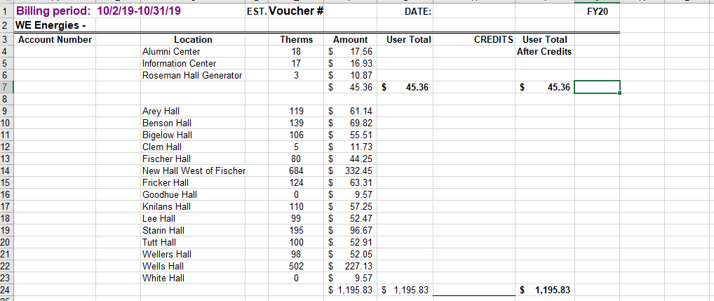
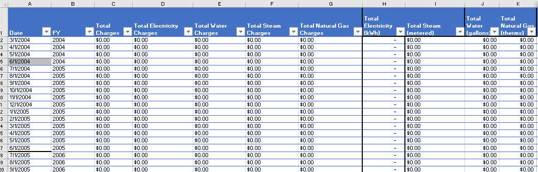
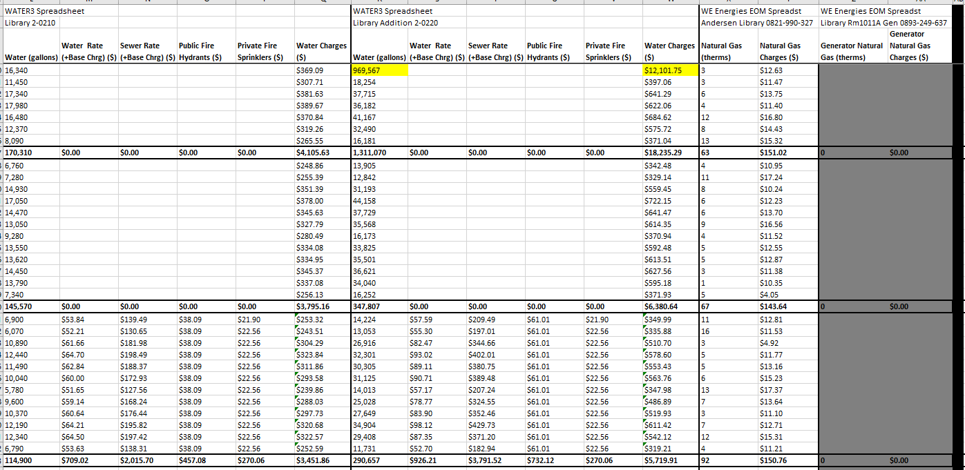
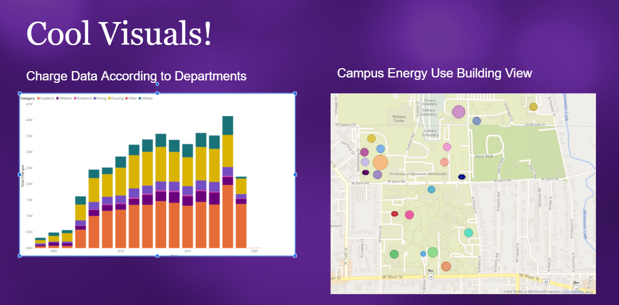
This process can seem daunting at first, but often is one of the easiest portions of my job and I think most people, if trained correctly, would also find it relatively easy. It is the portion of data analytics that takes up well over 90% of time and energy, converting and creating what we have as data into something that we can plug into a website or piece of software that can analyze and interpret it. This conversion in data types might seem a bit mundane at first, but consider this: which of the data below would you rather interpret?
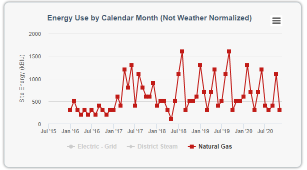
The above examples aren’t meant to knock on how data was gathered and interpreted previously. If anything, the first visualization would not be possible had the prior work never been done in the first place, but it highlights how additional development and refinement to the data on hand can create stories that were previously hiding under an assortment of cells and rows. This work can open up many doors into creating efficiencies in energy use on campus and narrow down issues that might have previously been known but understood poorly. Visualizations like the one above are truly just the beginning of the work data analytics can do for any organization’s data, but to keep things simple I’ll stick to how any employee can provide data analytics value to their job.
How Can I Help?
Without getting too far into the weeds of how one technically performs data analytics, I think there are some general ways in which anyone can provide value in this critical area of business operations.
Keep your data in an organized electronic form
Barring any privacy or legal concerns, one of the first and easiest points of data analytics is maintaining an organized electronic file of the data that you perceive as having value. Having data on member participation, recycling rates, or a survey in physical form will prevent deep dives into data analytics, so convert relevant data and maintain that data in a logical and organized way. When I say logical and organized way, I mean within the confines of an appropriate data structure for that data. If it’s numerical data, keep that data within the confines of a structured spreadsheet with well-defined columns and rows.
File Organization and Process Documentation is Essential
Once we have the data within the confines of a spreadsheet, now we need to make sure we know what this data is describing and when. The energy used to create the spreadsheet should also match the energy to maintain a clear and organized file folder. File folders where each spreadsheet can find its appropriate home will help future data analysis on an underlying file because there is a clear source file to work with that is accurately and appropriately described.
Keep It Simple & Get Creative
As I said before, it is a common misbelief that since we’re doing data analytics we have to get into the weeds of complex formulas, macros, and data analytical tools. Sometimes the most straightforward way to answer a question about underlying data is just to visualize the data. There are many ways to visualize a spreadsheet. Internal to the spreadsheet program, both Google Sheets and Excel have built-in visualization tools such as pivot tables and chart functions, but there are a couple free external tools (for students) that allow for more flexibility and depth if needed. PowerBI and Tableau are both powerful software platforms that allow individuals and organizations to create striking stories about their data and I recommend anyone to poke around with the software to get comfortable using them and learn the visualization portion of data analytics. Lastly, when keeping it simple, make sure to keep the process for recording information into your spreadsheets relatively straightforward and documented in some manner. Often our spreadsheets outlive the job we may be currently working as college students, so it is important to have some semblance of simplicity for yourself and other coworkers to maintain the work you have done.
Personal Guidelines for Data Analytics
As a passing point, I think that if you intend on participating in data analytics it is important to keep these points in mind while you work towards creating data structures for your organization’s data.
- Be patient – Data analytics is a marathon, not a race, in the way a newly planted tree may take years to grow into a fully mature tree, so it’s important to know that most of the work you will do will be in answering a relatively small number of questions in relation to the amount of data you gather. Be focused on the health and integrity of the data you are developing and its role within your organization, not just what it can immediately do now.
- Be an avid learner – Data analytics can be a difficult process when you encounter roadblocks that you’ve never had to overcome before. Being able to search an error code or look into the help section of a software to answer a question isn’t an admission of defeat, it’s a highlight of your perseverance in getting things to work
- Have fun with it – I have had many times where I put in several hours processing a long list of spreadsheets into a working input for PowerBI visualization and it wouldn’t work, but when I did get it to work and I got to see the visualizations that I could create, the work I did to create that was well worth the wait. So, don’t get overly frustrated, it’s all part of the process and look for the light at the end of the tunnel
If you are able to follow the guidance above and keep in mind those important components of maintaining good data you will be well on your way into introducing data analytics into your work.